Zepp E Circle Review: An imperfect, but solid, mid-range smartwatch
It’s 2020 and everything is smart (I didn’t say everyone). Smartphones, smart fridges, smart earbuds, smart coffee makers, you name it. We’ve even got smartwatches, and that’s what this review is about. The Zepp E is a smartwatch from Zepp, a sister company of Amazfit. It’s a mid-range option, priced at $250 in the US. Is it a good product, though? How well does it do basic watch things, and just how smart is it really? Let’s find out!
Zepp E: Specifications
| Spec | Zepp E – Square | Zepp E – Circle |
|---|---|---|
| Size | 43.3 x 35.7 x 9.0mm | 42.2 x 42.2 x 9.1mm |
| Weight | 36g | 32g |
| Material | Stainless Steel | Stainless Steel |
| Water Resistance | 5ATM | 5ATM |
| Display | 1.65″ AMOLED @ 348 x 442px | 1.28″ AMOLED @ 416 x 416px |
| Battery Capacity | 188mAh | 188mAh |
| Sensors |
|
|
| Bluetooth | 5.0 BLE | 5.0 BLE |
| Band | 20mm | 20mm |
About this review: Huami sent me a Zepp E Circle for review, which I’ve been using regularly for over a month. They had no input in this review.
In The Box & First Impressions
If you get the Zepp E, the first thing you’ll probably notice is how long the box is. Seriously, I know it’s a watch, but the bands don’t have to be straight out like they are. It is fairly nice packaging, though. You open the outer box to find an inner box. Open the inner box and there’s the watch. Take out the watch and the separator, and you’ve got another, smaller, box with the manual, charger, and an extra-long watch band in it.

The extra band is actually a nice touch. The one that the Zepp E comes with is too small for me, so it was nice to immediately be able to replace it with a longer version that fit my wrists better.

Moving onto the charger, I have to say I was kind of disappointed. Instead of using Qi charging, the Zepp E has one of those proprietary magnetic pogo-pin chargers. If you forget this charger at home, you won’t be charging the watch. Other than being proprietary, though, it’s pretty nice. It’s just a USB-A cable anchored to the charging base, so it’s easy to carry around and doesn’t require a special power supply.

Now for actually using the watch. It seems like Huami just can’t figure out how to make an easy pairing/setup process for its devices. When I reviewed the Amazfit PowerBuds, it took multiple tries to get them paired and set up in the app, and it was the same story with the Zepp E. And once I did finally get it paired, the out-of-the-box firmware update got stuck and failed multiple times before finally completing.
But once I actually got set up and got to use the Zepp E, my first impressions of the software were pretty good. It’s nothing fancy, and it isn’t standard software like Wear OS or Tizen, but it works pretty well. The custom software also means Zepp was able to give the watch an incredibly long battery life, which I’ll talk more about later.
The Zepp E Circle has a nondescript, nice and thin design
And finally, let’s talk about how the watch looks. The Zepp E is pretty nondescript. It’s not particularly flashy, nor is it ugly. I personally like it. The design for the round variant is just a simple circular stainless steel body with some glass on the front and some brackets for the watch band. It’s nice and thin, too, so if you’re reaching into a tight space, it’s less likely to get in the way. The Zepp E does have a pretty large diameter, though, so if you have a smaller wrist, it might look or feel a bit large.


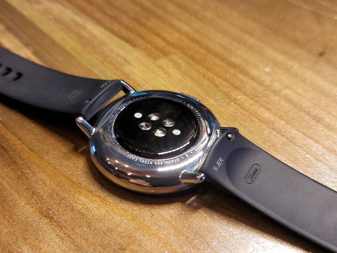
That’s pretty much it for this section. In true Huami fashion, the initial setup is terrible, but once you get past that, the product itself seems to work pretty well. Of course, I’ll get into more detail later on, but my first impressions of the Zepp E were pretty good.
Zepp E Circle: Display
The Zepp E is a smartwatch, so of course, it has a display. This isn’t a boring old monochrome LCD, though. It also isn’t one of those fancy double-displays that are both OLED and basic LCD. The Zepp E has a nice 1.28″ middle-ground AMOLED display. And it’s a pretty nice display, too. With a pixel density of 326 PPI, it’s up there with much more expensive watches like the Galaxy Watch Active 2. Unless you’re really looking for it, you’re generally not going to see the pixels.

The Zepp E also gets plenty bright. Even in direct sunlight, I haven’t really had issues seeing it. Since the Zepp E comes equipped with an ambient light sensor, you’ll never have to worry about manually cranking up the brightness outdoors, or being blinded at night because you forgot to turn it back down.
So we’ve got high-res and high-brightness. What else? Well, 1.28″ is a nice diameter for a round display. It isn’t ridiculously large, but there’s still a lot of room to show dense information and make swiping around the UI easier.
Finally, a slight negative. While the display has a pretty high pixel density, and you usually don’t see the pixels, when you do, it’s a little easier than I’d like. There’s either some weird pixel layout here, or the software isn’t doing a very good job of anti-aliasing because sometimes things just look weird. It’s not a big deal by any means, but it is there.
Zepp E: Software
It wouldn’t be a smartwatch without some software, and this wouldn’t be a smartwatch review without talking about that software. So let’s talk.
The Zepp E comes with its own custom operating system. You won’t find WearOS or Tizen here. But, depending on both what you want in a watch, and how well the software is made, a custom system isn’t necessarily a bad thing.
Unfortunately, Zepp’s software has a lot of negatives. There are some positives, too, but I’m a pessimist, so I’m starting with the bad stuff.
Notifications
First up, app notifications. One of the best features in any smartwatch (in my opinion) is the ability to see your phone’s notifications right from your wrist. While the Zepp E has a notification mirroring system, it’s really not that great.
By default, there are no apps enabled for receiving notifications, so you have to go in and enable the ones you want. There’s also no (de)select-all system, so if you want notifications from most of your apps, you’re going to be tapping for a while. On top of that, any new apps you install won’t automatically be enabled.
Once you finally get your notifications situation all set up, though… it’s still bad. The Zepp E ignores notification importance levels. So if you get a silent notification on your phone, the watch will still vibrate.
It doesn’t end there, though. When the notification pops up, it doesn’t actually tell you the name of the app. It does give you the icon (sometimes), and the notification title, but it’s not so easy to tell at-a-glance which app any notification is from. And if you actually want to read what the notification says? Good luck. Sometimes there’s text, sometimes there isn’t.
Next up, clearing notifications. When a notification pops up, you can’t clear it from there. You have to first back out with the single hardware button, then swipe up into the notification center, and then scroll down to the bottom to tap the “clear all” button. You can’t just dismiss one. And that button isn’t always there. It just randomly disappears.
Finally, the notification center itself on the watch. You enter it by swiping up from the bottom of the display, and it’s fine. It displays a list of notifications it’s received since you last cleared it. You can tap an individual notification to see more details about it (if they’ve been recorded). But it’s pretty basic. Like I said earlier, you can’t individually dismiss notifications, and the button to dismiss them all doesn’t always work.
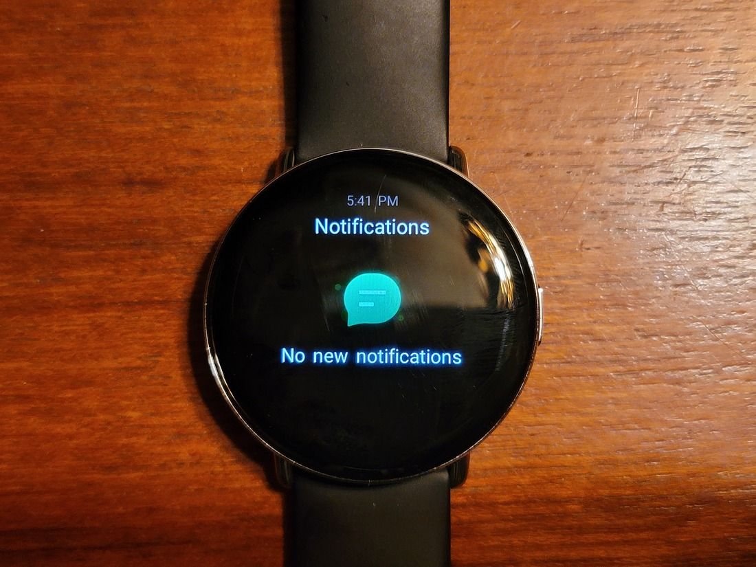
When you do dismiss all the notifications, it doesn’t sync that state to the phone, or vice-versa. The Zepp E’s notification system is pretty separate from the phone’s. You may like this behavior, but personally, I think it’s annoying.
So that’s a lot of negatives about notifications, right? Yeah, it is. Needless to say, you probably shouldn’t get this watch if you’re looking for a convenient way to receive notifications.
Units
Continuing on with the negatives, it’s time to talk units. In case you don’t know, there are two major units systems in use in the world: metric and imperial. Since I grew up in the United States, I’m used to the imperial system. Yes, I know it’s objectively worse in most cases compared to metric, but it is what it is.
So because I’m in the US, the Zepp E automatically set itself to use the imperial system… sort of. While all of the numbers are imperial, the unit labels are still in metric. So my 8-mile bike ride is recorded as 8 kilometers, and the current temperature as I write this is apparently 50˚C. I’ve tried switching the units to metric and back a few times, but it hasn’t changed anything. I’ve even gotten a few firmware updates during this (long) review period, but none of them have fixed this issue, either.
Obviously, once you realize that this issue exists, you can automatically switch the units in your head. After all, the numbers are right. But it’s still a weird oversight and one that I’ve reported to Zepp without a resolution so far.
Usage
OK, it’s time to get more general. And less negative! Instead of complaining about specific problems in the software, it’s time for general complaints and praises. Again, the negatives are going first.
The Zepp E only has a single hardware button, so it relies a lot on swipes to navigate around the software. For the most part, it’s OK, but it’s not always intuitive. Swipes sometimes have different actions depending on which part of the software you’re currently in, and sometimes those swipes are just replaced with buttons to tap.
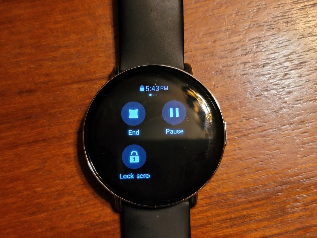
It’s just not always obvious what you’re supposed to do, like when exiting a workout. My instinct was to press the hardware button, but you’re actually meant to swipe in from the left of the screen and tap the stop button there. There’s no indicator that there’s a control panel there. You’re just supposed to know it exists.
Thanks to the way the display is designed, though, without any protruding bezel, the swipes are easy enough to perform. There’s no fighting with a lip to reach the edge of the display or anything.
But remember when I said this was going to be less negative? Well, that’s where this next bit comes in.
Overall, Zepp's software is pretty fluid
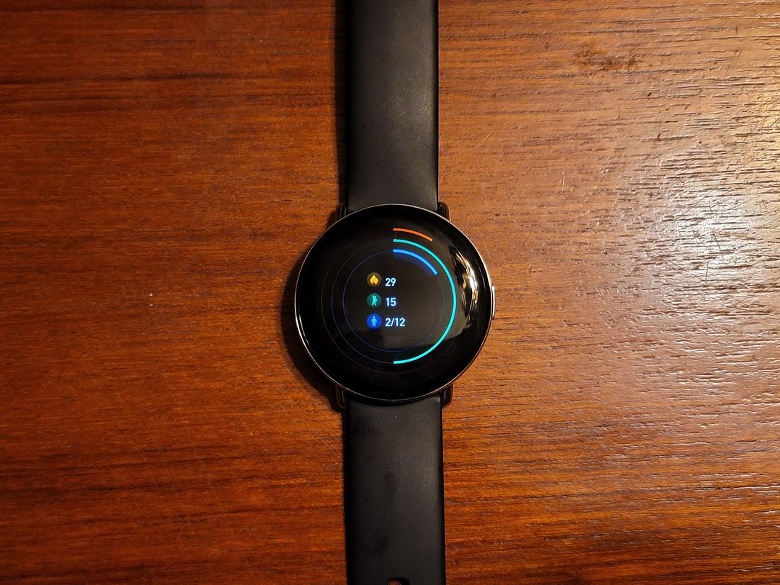
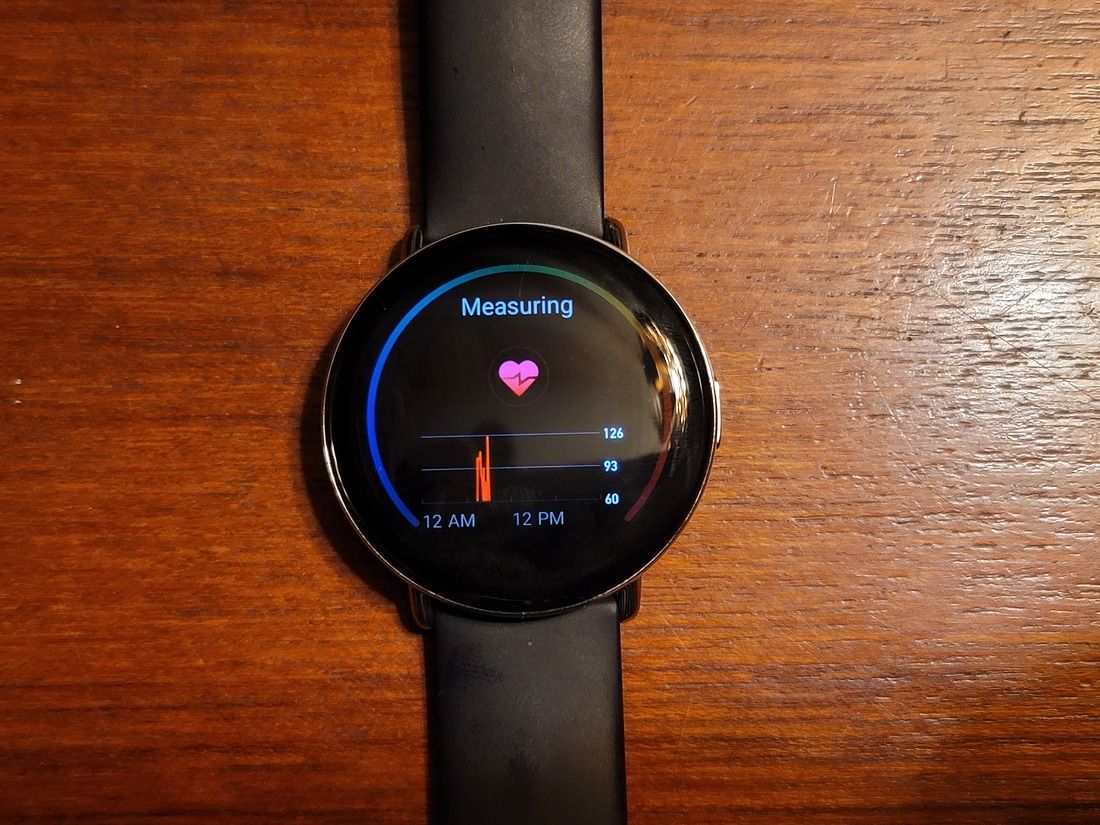
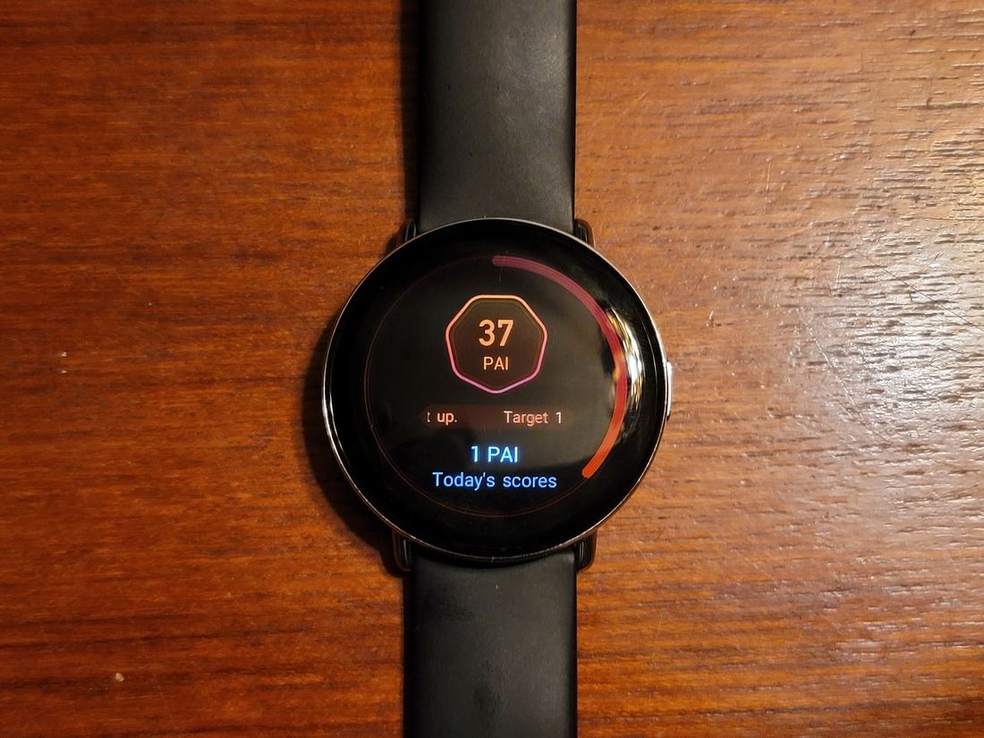
Overall, Zepp’s software is pretty fluid. I don’t think I’ve ever seen it freeze or stutter, and it’s always responsive to taps and swipes. The animations aren’t exactly fancy, and they run at a pretty low frame-rate, but they’re consistent when they play. That’s more than I can say for my Galaxy Watch Active2. While the animations there run at much higher frame-rates, I constantly notice them stuttering and I’ve had the watch freeze a few times with a blank home-face.


Features & Customization
Now for another less-negative segment: this one!
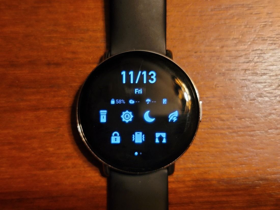
Since the Zepp E has its own custom software, customization is limited to what Zepp gives you. Luckily, they give you quite a bit.
In terms of watch faces, there are lots of choices. You can go for a simple time-only face with a customizable background image, or you can go for an information-dense face with the time, weather, fitness details, and more. There are also plenty of styles in each category and level of complexity. So while there may not be third-party options, you’ll probably be able to find a watch face that works for you.
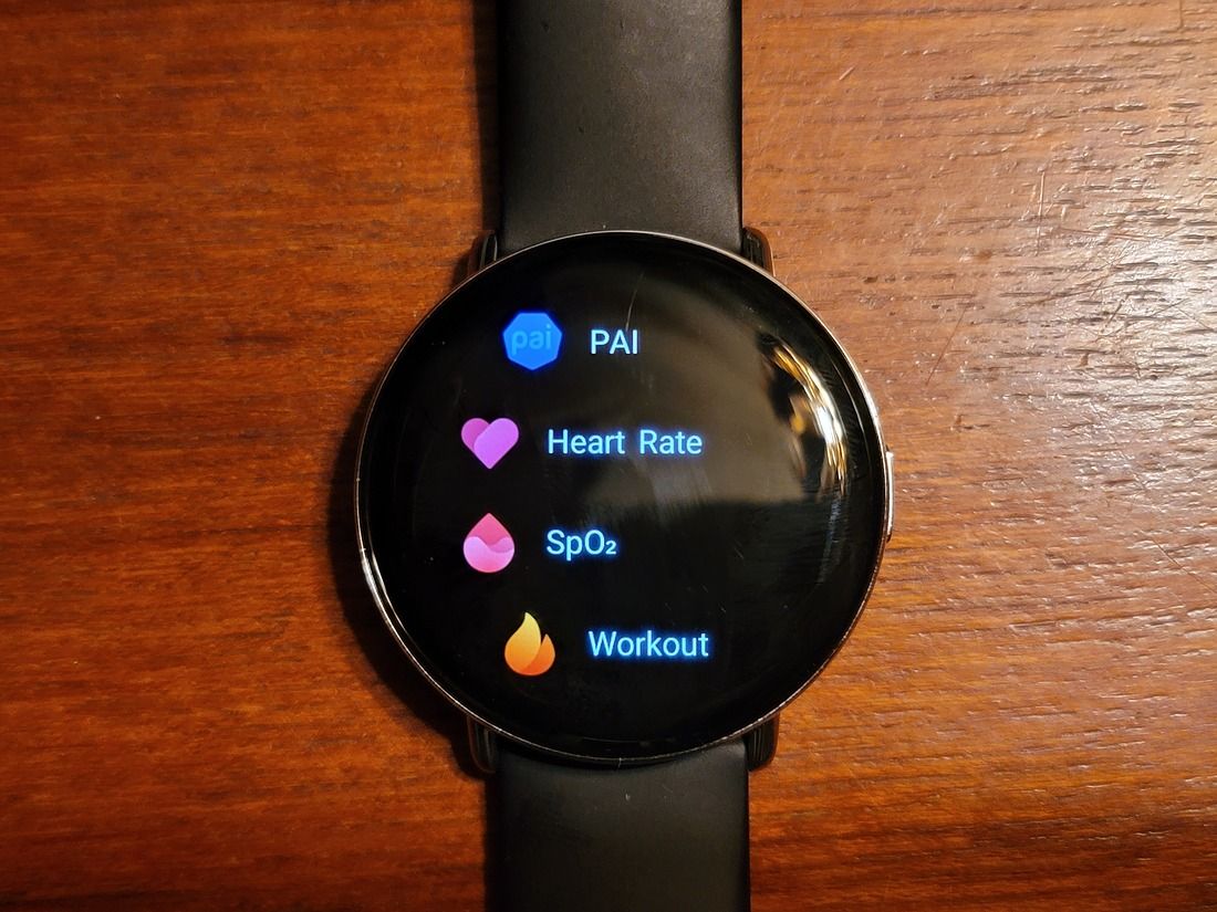
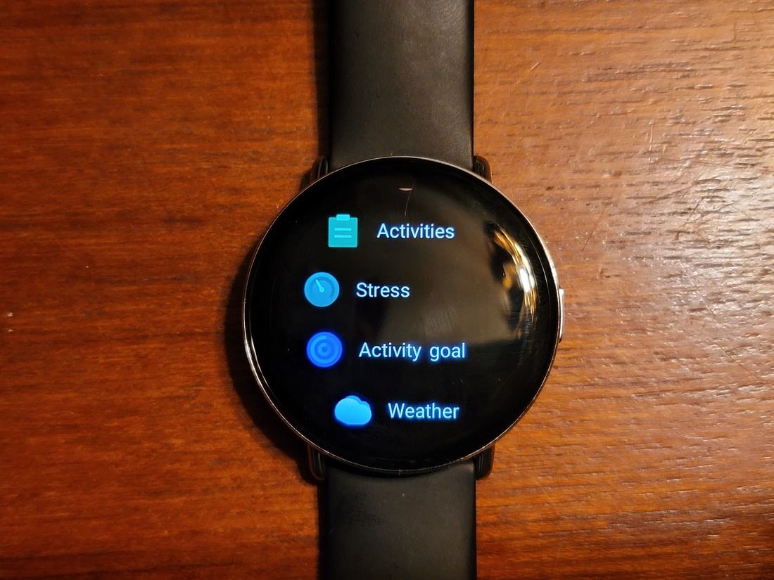
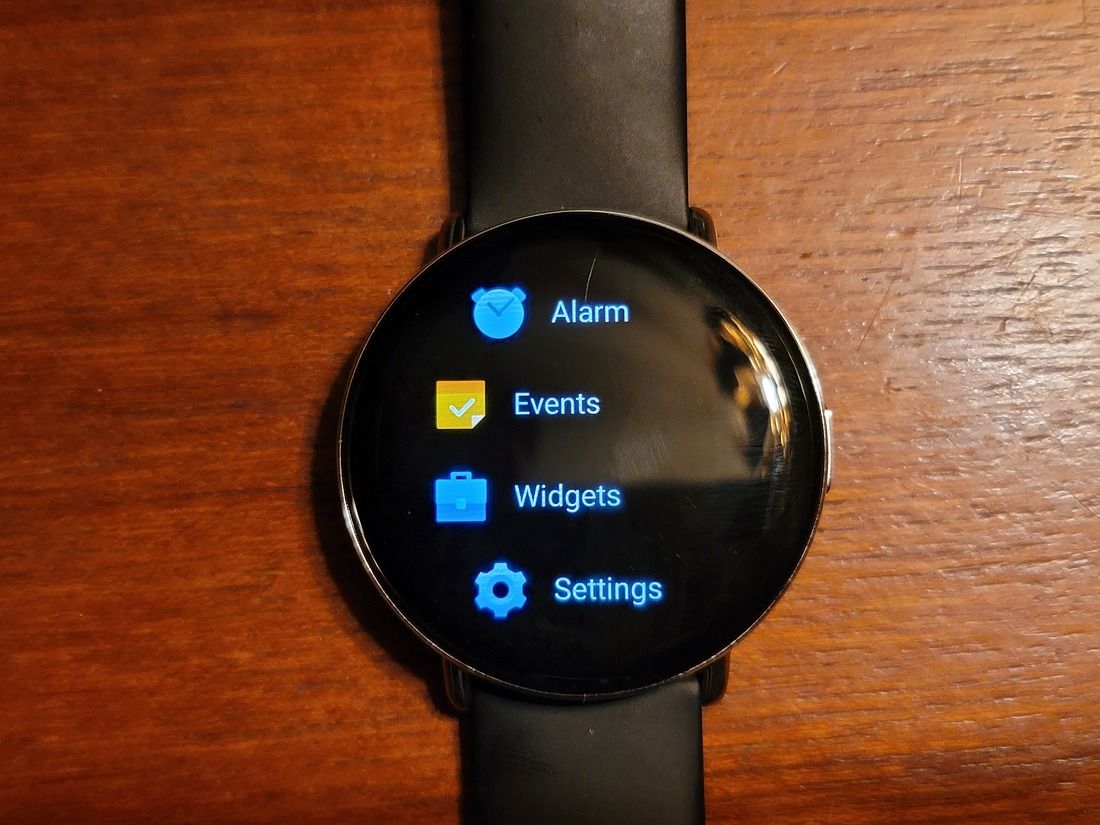
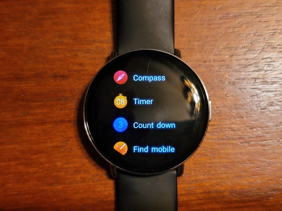
But what about apps? Unfortunately, there’s no app store for the Zepp E. The apps already on the watch are all you get. There are plenty of apps, though, mostly fitness-focused, like measuring your stress or SpO2 level or starting a workout. There are also a few non-fitness apps, like a compass and a to-do list.
While you may not be able to use the Zepp E to navigate through the city, there’s still plenty it has to offer in terms of functionality.

Zepp App on your smartphone
And now something that’s technically software, but not really the watch software: the phone companion app. Previously known as the Amazfit app, the Zepp app lets you do quite a few things involving a connected Zepp E.


On the home page, the Zepp app gives you a summary of all things fitness: step count, heart-rate, goal tracking, etc. Tap a card or tile to see more details about it. Over on the “Enjoy” page, the Zepp app lets you set various options, like choosing what your watch should do when you’re getting a call, setting up an alarm clock, finding the device, and a whole lot more. And finally, the Profile page. This is where you can see your connected Amazfit or Zepp devices, and change advanced options. You can check for firmware updates, take a customer satisfaction survey, and do some more random things.
Overall, the Zepp app is actually pretty nice. It’s lacking polish in some areas, and I’ve never had very good luck with the initial pairing process or firmware updates, but once it’s working, it works pretty well.
Zepp E: Fitness
The main focus of quite a few smartwatches is fitness, and the Zepp E is no different here. But how many fitness features are there, and how well do they work?
Workout Tracking
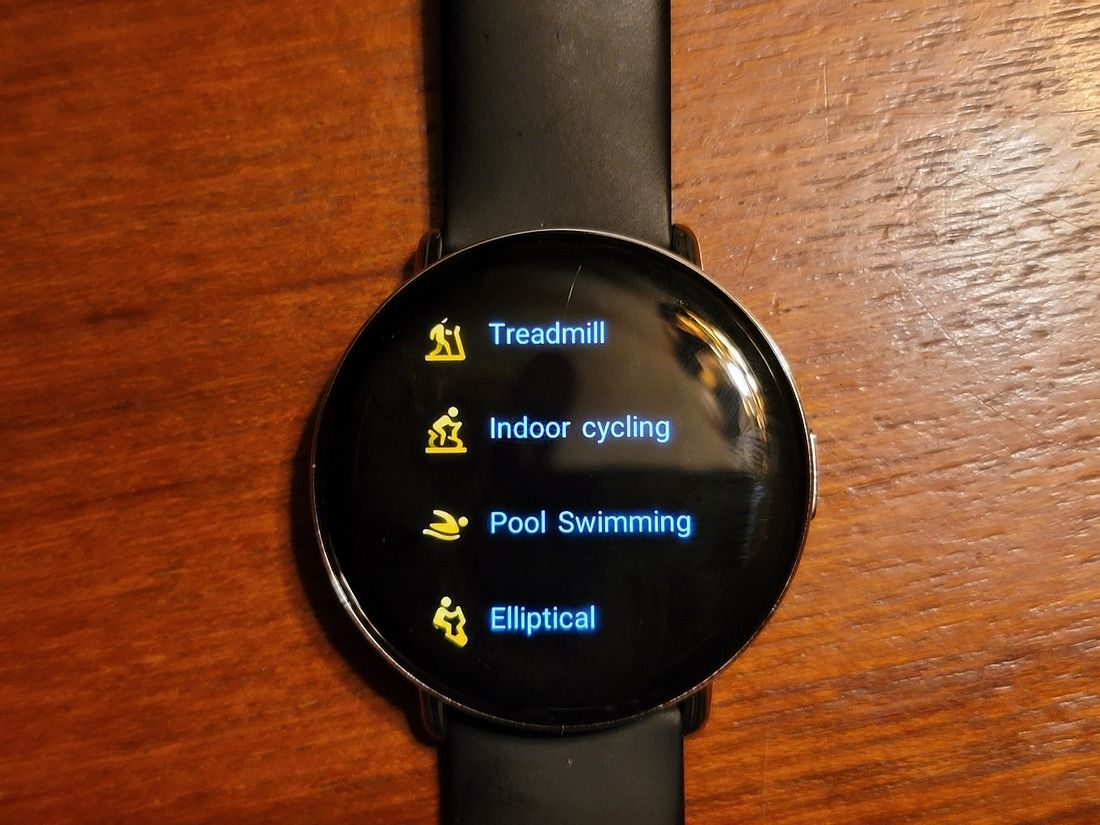
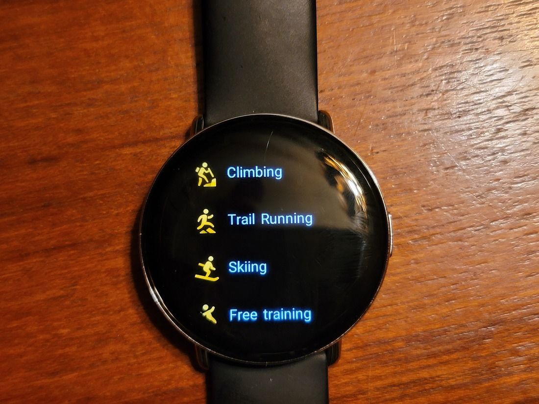
Like any fitness-focused watch, the Zepp E has workout tracking. You can choose from a whole bunch of different workouts, including running, walking, cycling, swimming, climbing, hiking…. even skiing is an option. And of course, there are the standard gym-related tracking options for the elliptical and other activities.
I’ve mostly used the Zepp E to track cycling, and at least compared to my Galaxy Watch Active 2, it does pretty well. All the metrics, like average heart rate, distance, and the path taken, all match almost exactly. The only problem I’ve had is the occasional notification about losing GPS, but it doesn’t really seem to affect anything.
One notable omission from the Zepp E’s fitness tracking, though, is automatic tracking. The Galaxy Watch Active 2, for example, is able to detect when you’re doing a certain known workout and automatically track it. This has been useful for me since I tend to forget to manually start the workout. It’s not exactly a big issue, but it would have been nice to have.


Sensors
But how does the Zepp E track workouts? Well, for things like position and speed tracking, it uses the Bluetooth link to your phone. For everything else, there’s a set of sensors on the back.
To give you better workout data, the Zepp E is able to track and record your heart-rate and SpO2 level. It can also use that data to do things like tell you how well you sleep or how stressed you are. I don’t really have any way to check the accuracy of the SpO2, but the measurements I’ve gotten aren’t in the 80s, like a certain Samsung watch.
Interestingly, there’s also an ambient light sensor on the Zepp E. I don’t know where it is, but I do know that moving the watch under a bright light will cause the screen to smoothly brighten and vice-versa. This is definitely a nice feature, and one I’m not sure even the Galaxy Watch Active 2 has.
If having auto-brightness on your watch isn’t enough, how about a compass? The Zepp E has a geomagnetic sensor in it, along with a simple compass app. So if you’re stranded in the middle of the woods somewhere, remember to bring your Zepp E.
Now, as far as I know, the Zepp E doesn’t have a built-in GPS. If you’re going to use it to track your workouts, it’ll need to be connected to your phone. Of course, Zepp doesn’t really seem to be marketing this as a standalone watch, so that makes sense.
Extra Features
This is going to be a short section. While the Zepp E has most of the basic features you’d expect in a fitness-focused smartwatch, it doesn’t really have much extra. The only potentially notable feature is the inclusion of a vibration motor. There’s no speaker or microphone, but you can still get alerts with a virtual tap on the wrist.
Zepp E: Battery & Charging
One of the major limitations of smartwatches seems to be battery life. It’s not hard to find $1000 watches that only last a day or two at most on a charge.
Well luckily, the Zepp E isn’t $1000. Also luckily, it lasts a really long time. Even with workout tracking, it should easily last at least five days before it needs to be charged again. At that point, charging speed doesn’t really matter. Just charge it over the weekend or put it on the charger for a bit when you can.
Even with workout tracking, the Zepp E lasts at least five days before needing a charge
It’s a good thing that the battery life is so good, too, because the Zepp E uses one of those proprietary magnetic pin chargers. The charger is a simple cable with a USB-A plug on one end and the charging interface on the other, so it’s small, light, and easy to carry, and will work with any 5V USB socket.
But if you forget the charger, you’re not going to be topping up your watch. The Zepp E doesn’t have any form of wireless charging, Qi, Samsung, Apple, or otherwise.
Zepp E Circle: Comfort & Fit
When it comes to something you’re supposed to wear on your wrist all day, it’s pretty important that it’s comfortable, whether that concerns how the watch itself feels on your wrist or how good the stock band is.
My review unit of the Zepp E came with Zepp’s 20mm leather band, and unfortunately, it’s not very comfortable. The edges of the band are kind of sharp, and it digs into my skin, which isn’t really that fun. Luckily, it’s just your standard 20mm watch band, and can be replaced with any other standard 20mm watch band.
Since I’d already replaced the band on my Galaxy Watch Active2, I just put Samsung’s stock silicone band on my Zepp E. While it’s not perfectly comfortable, it’s definitely better than the leather one. Zepp does also provide metal and rubber bands, but I don’t have them so I can’t say how good they are.
Aside from the band issues, though, the Zepp is plenty comfortable. It’s much thinner than my Galaxy Watch Active2, so it’s even harder to notice. I have no problem wearing it for a day and occasionally through the night.
Conclusion
The Zepp E is a pretty solid smartwatch
Overall, the Zepp E is a pretty solid watch. You’re not getting some of the more fancy features you see from Samsung or Apple, such as ECG and automatic tracking, and there are currently no third-party apps or watch faces available, but seeing as the Zepp E Round costs $250 in the US, I’d say there’s some justification.
There are even places where the Zepp E does better than its more expensive competition, like in battery life. Apple and Samsung can’t even hope to get 5 days normal usage from their watches. If you want a featured smartwatch with good battery life, you’ve found it here.
The only real complaint I have with the Zepp E is the software quality. Like I mentioned earlier, the setup process just doesn’t work well at all. And little quirks like it showing the wrong units for measurements aren’t terrible, but it does show lack of attention to detail.
In the end, though, I do like the Zepp E. It’s a solid product, and it’s good to see some midrange options for smartwatches.
If you’re interested in buying the Zepp E, you can grab it on Amazon in the US for $249.99.
- The Zepp E circle is a good smartwatch for its price with a decent repertoire of fitness tracking and a good style quotient.
|
Features: |
|
|
|
Pros: Cons: |
The post Zepp E Circle Review: An imperfect, but solid, mid-range smartwatch appeared first on xda-developers.
from xda-developers https://ift.tt/2IVyaoL
via IFTTT

No comments: